Translating scientific information into something visual is not always easy. If you want to create something eye catching, easily to understand and accurate, you will need, at least, some basic understanding about design principles.
But don’t worry, you don’t need to spend hours on the internet looking for information about design. We have already done that for you! In this post, you will find 10 design tips applied to graphical abstracts and science illustrations to help you create the best visual ever.
Post index:
- Choose a good color pallette
- Make sure there is enough contrast between colors
- Understand colors meaning
- Organize the information properly
- Align the elements
- Play with proximity and consider white space
- Use different arrows for different purposes
- Choose a typography wisely
- Establish hierarchy to guide readers
- Be consistent throughout your visual abstract
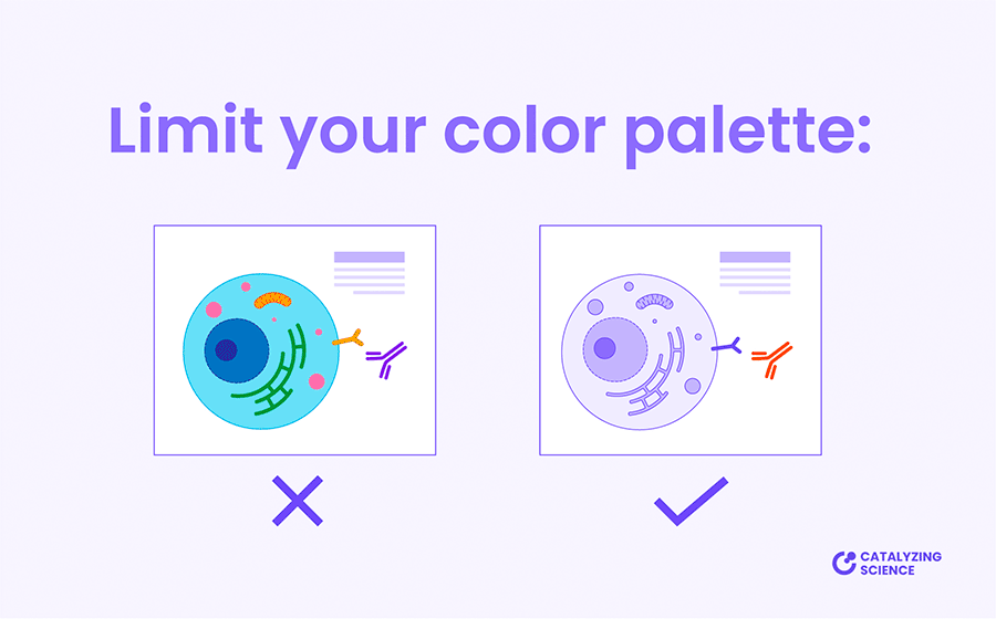
1. Choose a good color palette
Color plays a crucial role in design. People interpret things differently depending on colors. Think about traffic lights or the colors of some toxic animals and insects.
For this reason, choosing a good color palette for your graphical abstract is an important step, but is not always easy.
Learning about color theory is the way to go to understand which colors look good together and which ones fit better with your story. But to keep things simple, in this post we will just mention some general recommendations:
- Try to keep your color scheme as simple as possible. Reducing the amount of colors helps to draw readers attention to the key elements of your scientific story.
- If you want to add depth to your illustration without incorporating more colors to your palette, use darker and lighter versions of the selected colors to create a color scale.
- Avoid using extreme colors. Too bright colors are annoying to look at and make the eyes of the viewer tired.
- Keep away from color combinations that are not easy to differentiate by people who are color-blind, like: red and green, green and brown, blue and purple or green and blue.
2. Make sure there is enough contrast between colors
Contrast is another important aspect that we need to consider when coloring our scientific illustration.
If some illustrations are represented over others, such as organelles inside a cell, it’s essential to use a color combination that allows the viewer to clearly differentiate all the elements. In these cases, avoid using middle tone colors over middle tone color. To create contrast, it is better to use a bold tone color over a light one.
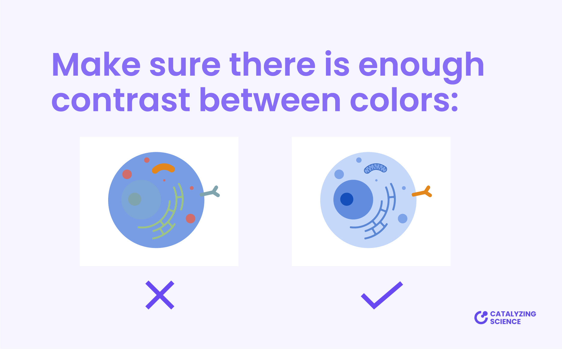
Playing with color contrast is also a great strategy to emphasize key concepts. Use vivid colors for the main information of your visual abstract, they will catch the readers’ attention first.
On the contrary, it’s better to select neutral or muted colors for less essential elements and the background, so they will remain in a secondary plane.
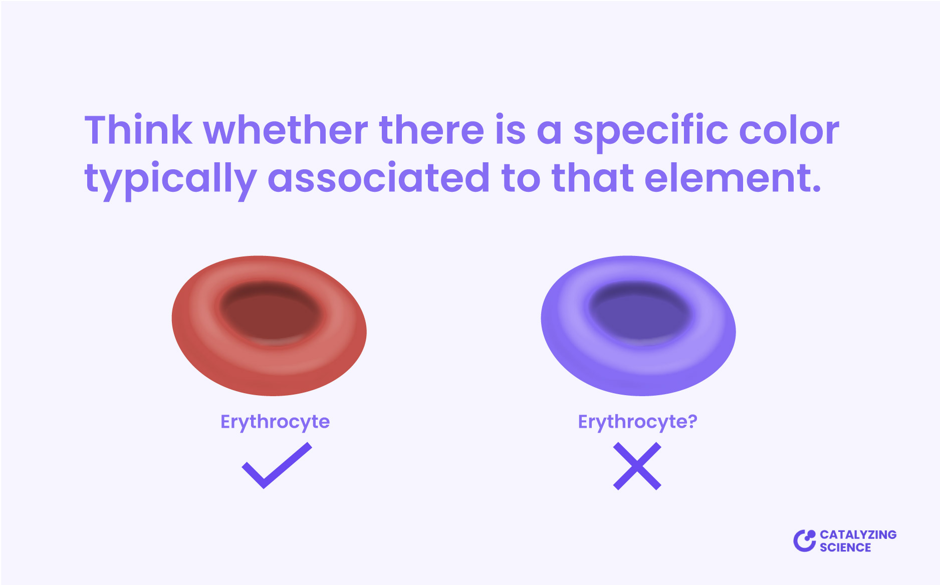
3. Understand colors meaning
Some elements are typically represented using a specific color, so in order to avoid misinterpretation, represent them as people expects. For instance, erythrocytes are easily to recognize because of their shape but also because of their red color.
Colors can also be perceived as “good” or “bad“. Red is often used to represent danger and warning. Thus, if you are illustrating a tumor cell it could be interesting to use reddish color for these items, to reinforce the idea that they are bad.
Being consistent with the color selection also help to reduce the time needed to interpret the illustration. Viewers will perceive items as related if you paint them using similar colors. For example, if you want to represent cells obtained from a specific organ, that relationship would be easy to understand if you use similar colors for the organ and the cells.
For the same reasons, if two elements are not related at all, and you want to make that point clear, it is better to use two different colors highly contrasted, like orange and blue.
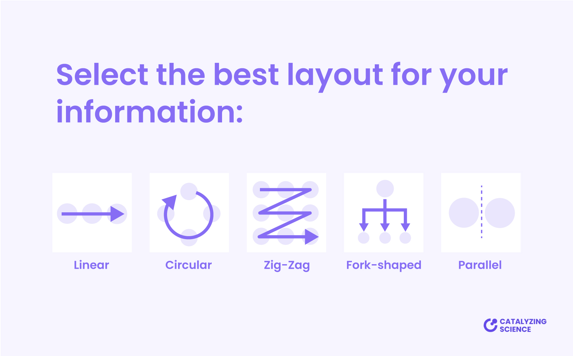
4. Organize the information properly
The information on your graphical abstract must be organized logically. It’s important to create a reading order that guide readers through the story.
The typical reading direction is from top to bottom and left to right, so try to present the elements following this direction.
To do so, there are different layouts that you can use to arrange the content of your visual abstract. Try to select the one that fits better with your scientific story. For instance, you can use a circular layout if your process starts and ends at the same point; or a zigzag layout if your story have multiple sequential steps.
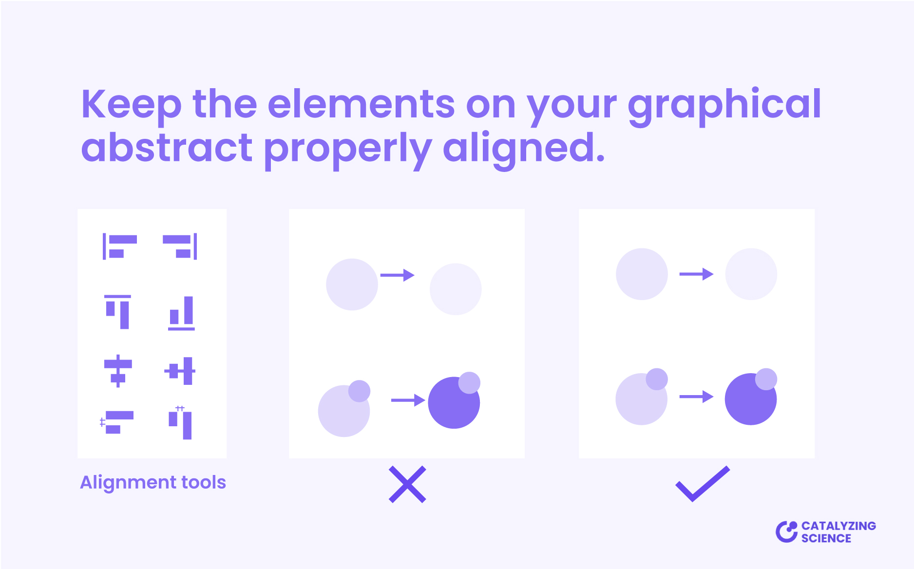
5. Align the elements
Remember to keep the elements on your graphical abstract properly aligned. This makes your visual summary to look clean and organized.
You will find specific alignment tools to easily align and arrange elements in almost all design programs used to create visual abstracts. In addition, you can use grids and guidelines to make this process even easier.
6. Play with proximity and consider white space
Playing with proximity and white space can also help to go from a hard-to-follow and confusing illustration to an easy-to-understand image.
Proximity consist in grouping together items that are similar or related to each other. Arranging elements helps to visually emphasize their relationship, and makes your graphical abstract easier to understand at a glance.
Boxes and circles are sometimes used to group elements together, but usually they are not necessary. The easiest and clean way to do so is just put the related items in proximity.
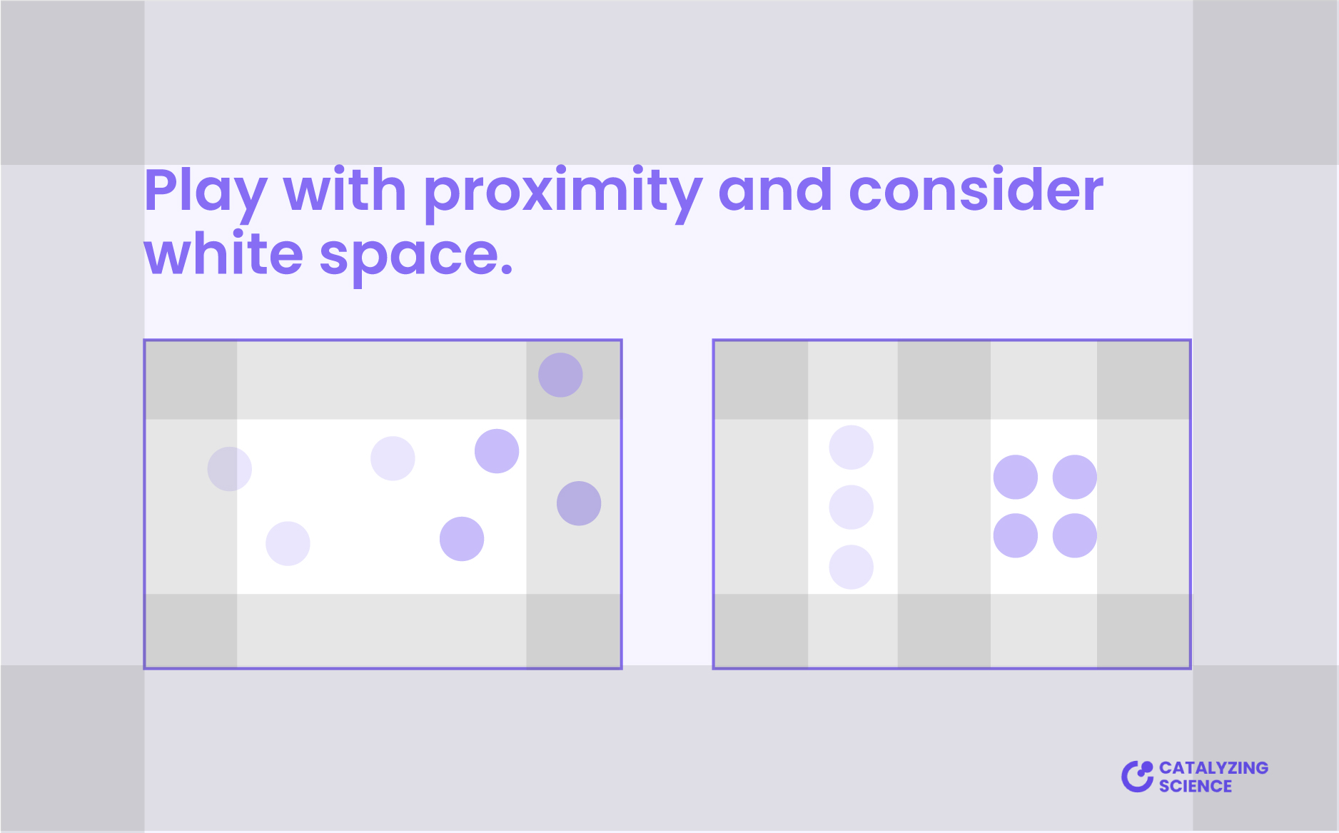
White or negative space is also key in reinforcing the relationship between the elements. It refers to the areas of your visual abstract where there is no content. Simply put, it is the space between the different elements.
White space helps to separate processes and information, and will avoid a cluttered looking graphical abstract. It gives elements room to breathe, so always remember to leave enough white space at the margins of your illustration.
7. Use different arrows for different purposes
You can play with the aspect of lines and arrows on your graphical abstract to confer them different meanings.
Arrows are typically used to indicate direction, but they can also mean activation. If you want to indicate that a process is over activated or reinforced, you can make them thicker.
On the contrary, to indicate inhibition, just substitute the arrow by a short perpendicular line at the end.
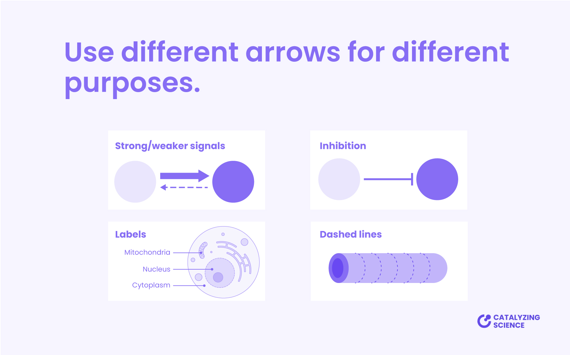
To label the elements of your scientific illustration, use pointer lines (i.e., lines ended with a dot), and dashed lines can be used to indicate weaker signals, sections, and incisions.
Try not to cross the lines and remember to be consistent and use the same line style in each case.
8. Choose a typography wisely
When we read, beyond the meaning contained in each word, we also receive information from the typography (font) used. For instance, a fun handwriting font can be perfect for a kindergarten. But that same style will look unprofessional for a lawyer.
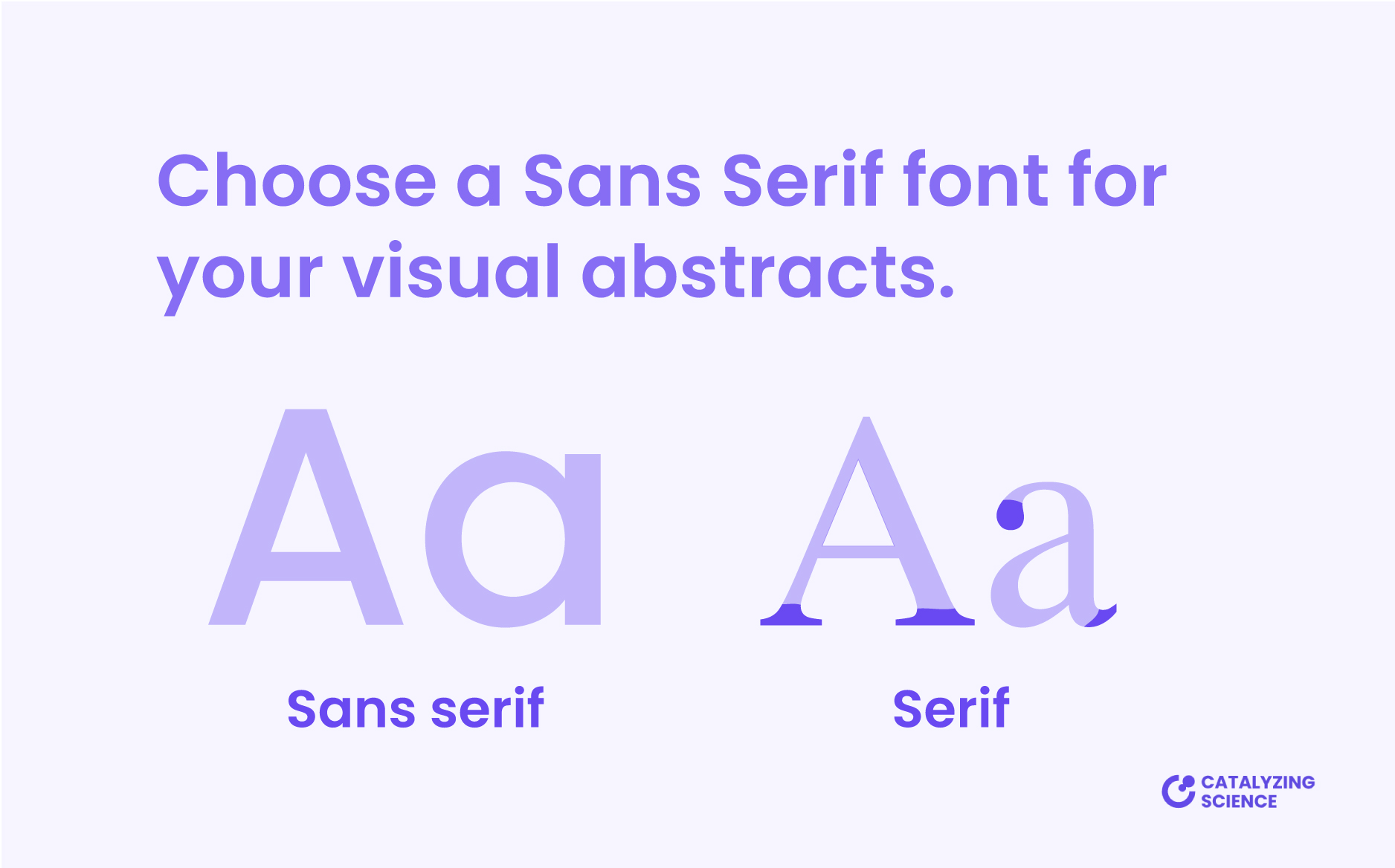
Fonts can be classified in three main categories: serif, sans serif or decorative. Serif fonts are the ones that have small decorations on the end of the characters, whereas sans serif haven’t.
The classic example of a serif font is Times New Roman. These types of fonts are typically used in printed documents with lots of text, such as newspapers or books.
Sans serif fonts are the recommended ones for scientific illustration and graphical abstracts. They are simpler, easier to read, and appear more modern. A typical example of these type of fonts is Arial.
Decorative fonts are the ones with a more playful and illustration style, like handwriting fonts. Despite they may look fun, it is better not to use them for general purposes. These fonts are more difficult to read and don’t look professional. However, in some specific cases, they can be useful, such as for graphical abstract made in a comic style.
Try to keep your text at minimum, remember that you’re trying to explain your story visually. If some words can be replaced by an illustration, do so, or just delete them if they are not essential. Make sure your font size is large enough, so your text is easy to read.
Where to find new fonts?
If you are tired of the default fonts installed on your computer, check Google Fonts. There are lots of typography packages to download and all fonts are released under open source licenses. Just click categories and select sans serif.
9. Establish hierarchy to guide readers
Hierarchy consist in adjust the design characteristics of the different elements to help the readers navigate your work. It shows them which information is more important using different levels of emphasis.
There are different ways to catch viewers’ attention. Just determine what are the key points of your visual abstract and make them stand out. Remember that hierarchy applies both for illustrations and text.

You can play with size, color, or bold to highlight important items. The goal is to make them stand out. For instance, use bold colors for key elements, and muted or neutral colors for minor details and background.
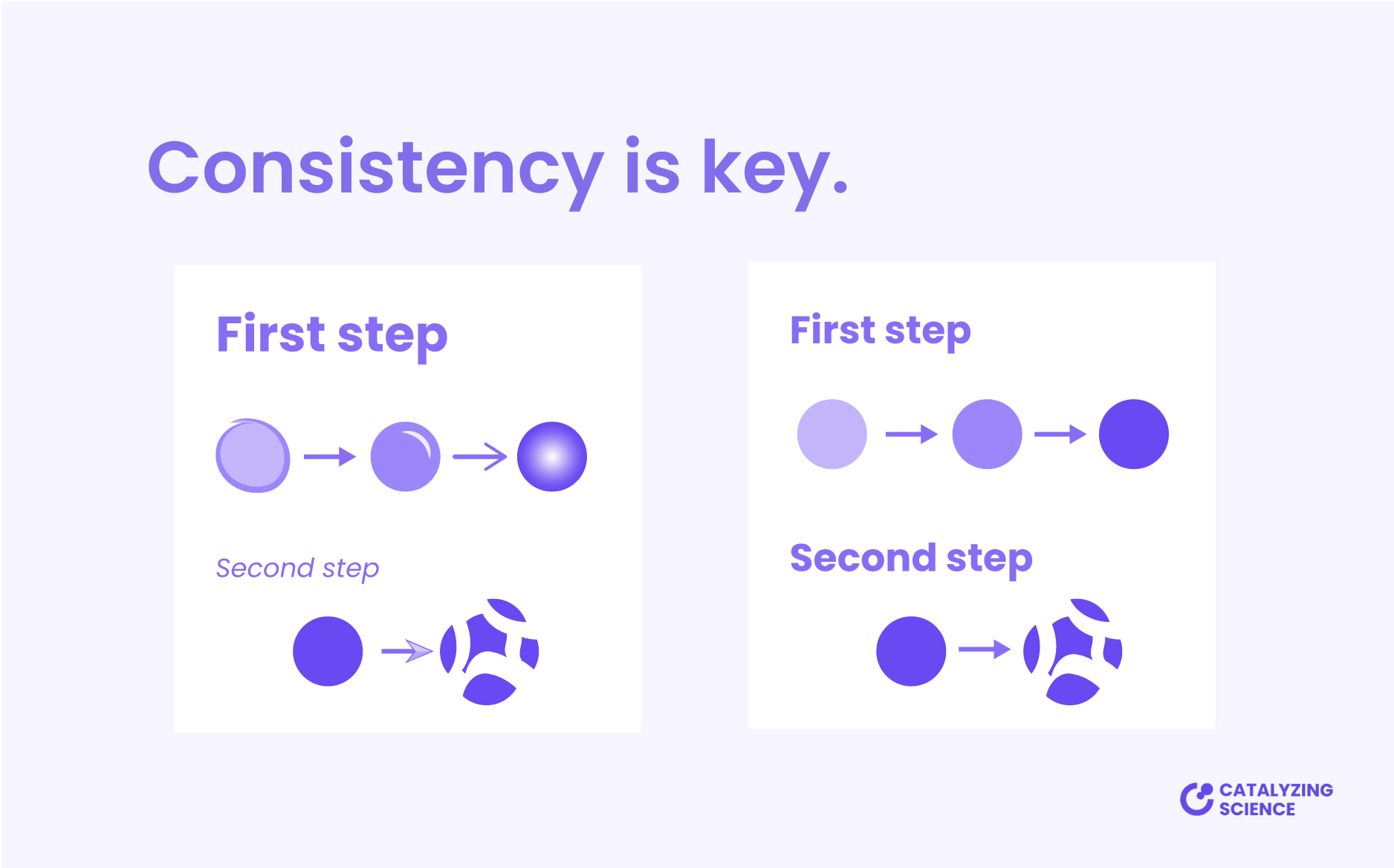
10. Be consistent throughout your visual abstract
Having a consistent look and feel across your graphical abstract makes your work easier to read. Consistency allows viewers to focus on the content instead of trying to figure out if the design differences have a special meaning.
To do so, use the same color palette, hierarchy styles, type of lines and arrows, and fonts, throughout your visual abstract. Mixing different illustration styles creates noise and makes the graphical abstract look unprofessional.
There are a lot of websites from which you can download free illustrations and icons, so feel free to use them. These resources can be a great solution to simplify the process, but try to keep them consistent.
If that is the case, modify the downloaded illustrations to match the rest of your design by altering their colors, lines, and style. To make things easier and whenever possible, remember to download the vector file format (.ai, .eps, .pdf, or .svg), as they are easier to customize.
If graphic design is definitely not your thing, and you prefer to spend your time working on your research project, we can help you!
At Catalyzing Science, we are specialized in creating engaging scientific illustrations and visual abstracts. So, don’t hesitate to contact us for more information! You can also check the portfolio to see some previous work!